Cuatro is an invented gelato brand from Studio NNTN, made in AIGE: tomato red, chocolate brown and cream, a heavy wordmark that looks painted by hand, and a shop that feels like an old Bologna bar. No client is involved. The making of each piece is not documented, so this covers the choices behind it.
Going the other way from pastel and sprinkles
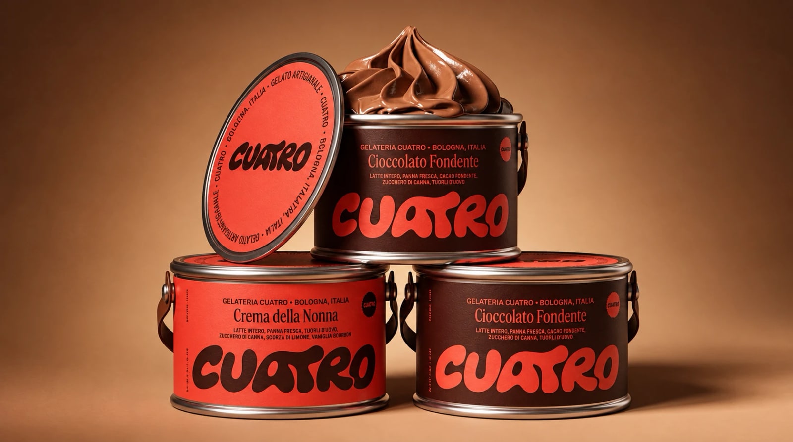
The project starts from an observation: gelato shops tend to sell pastel and sprinkles. Cuatro goes the other way: tomato red, chocolate brown and cream, a heavy wordmark that looks painted by hand, and a shop that feels like an old Bologna bar. The line is "one more scoop". The project covers identity, packaging and interiors.
When a whole category looks alike, one way to be remembered is to pick a look the category does not use. The risk is that it ends up as a costume. Three things are worth looking at below: one mark asked to work on four surfaces, two colors that trade places between letters and ground, and a line short enough to say at a till.
Made in AIGE · Cuatro · Studio NNTN · invented brand
One mark on the tub, the sleeve, the apron and the wall
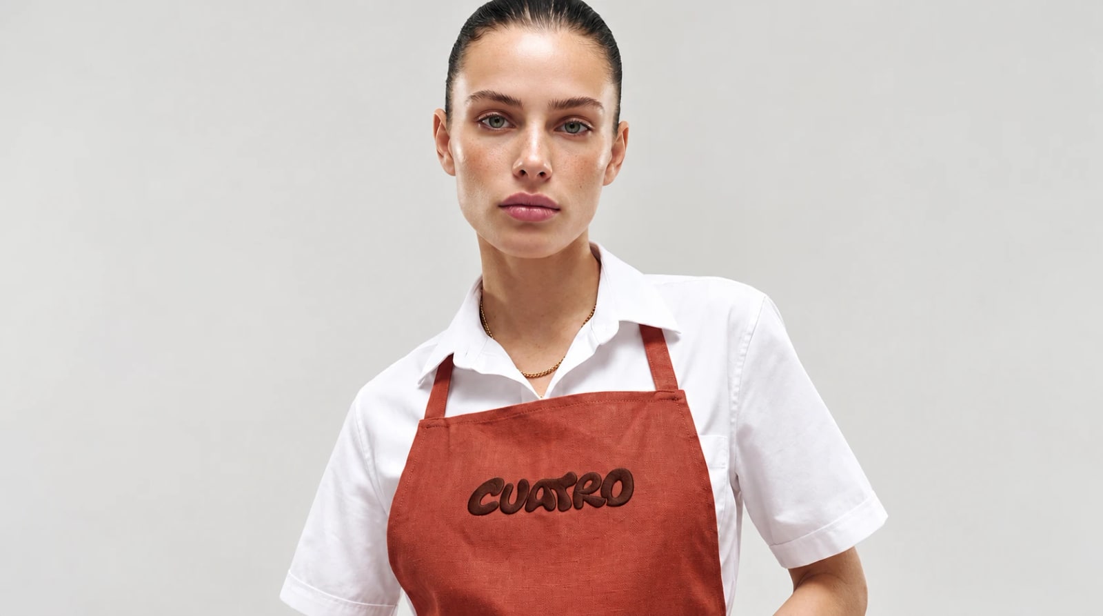
The project page says the same mark sits on the tub, the cone sleeve, the apron and the wall. It is shown in four chapters: The mark, The tubs, The counter and The shop. That is four scales in turn: a logotype, a tub you hold, a counter you lean on and a room you walk into.
A heavy, rounded wordmark is a practical choice for that job. Thick letters tend to be easier to print on a lid, stitch onto cloth or paint on plaster than thin ones, and they hold their shape when the surface is small or curved.
Made in AIGE · Cuatro · Studio NNTN · invented brand
Three colors, one line, no clutter
Swap the roles, keep the family. In the cover image, a red tub carries brown letters and a brown tub carries red ones. Trading two colors between ground and letters is a cheap way to make a range feel related.
The line fits a counter. "One more scoop" is something you could say while paying, and it asks for another scoop in three words.
The shop gives the mark a world. An old Bologna bar is a real kind of place, so the red and brown have a room to belong to instead of floating on a logo sheet.
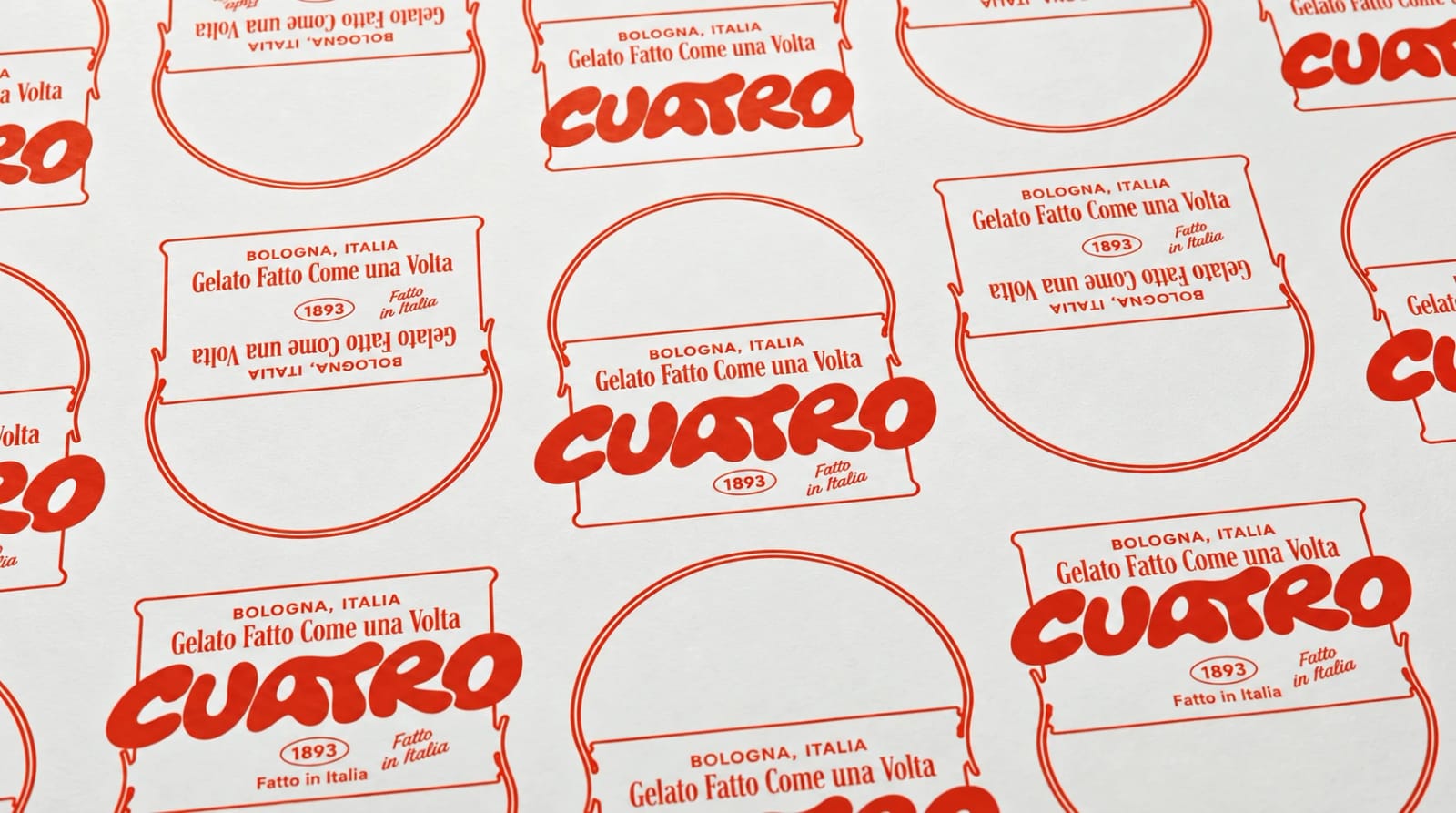
The sheet below is the same idea stripped down to one red and one wordmark, repeated until it becomes a pattern.
Made in AIGE · Cuatro · Studio NNTN · invented brand
Check your own mark the same way
Whatever tools you use, you can run four quick tests on an identity before you commit to it:
Put the mark on four unlike surfaces, such as a lid, a sleeve, a piece of cloth and a wall. If one needs a redrawn version, the mark is not finished.
Hold the palette to three colors and swap which one is the ground. If the swap breaks it, one color is doing too much.
Say the line out loud at a till or a door. If it sounds awkward, cut it.
Read every word of small print, in whatever language it is written.
The fourth test is the one people skip. Small text inside an image can come out wrong, and the AI image generator page lists that as a limit, so a person has to proofread every line of small print before anything ships.
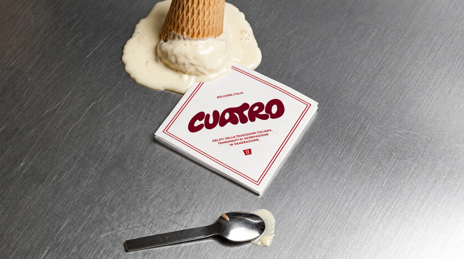
The image below shows one more surface, a paper napkin on a steel counter, where the wordmark still reads as the same mark.
Made in AIGE · Cuatro · Studio NNTN · invented brand
Putting a tub or a pack in a scene
The part of AIGE that fits packaging work is the image edit. Upload a photo of your real tub, sleeve or box, write where it should stand, such as a steel counter or a shop window, and the edit sets that pack into the new scene. The AI photoshoot page lists this as products in a scene. AIGE has no dedicated product-photo tool yet, so check every result against the real pack: the lid, the colors and each word on the label.
AIGE has no logo tool, so bring your own mark and use AIGE for the pictures around it. Images start at 1 credit, the price of a 1K draft on GPT Image 2's low setting, and retakes cost the same as first runs, so budget for a few tries per scene. Start from a clear, well-lit photo of the real tub.
Honest note: Cuatro is an invented brand, so there is no client result behind any of this. The studio that made it, Studio NNTN, is a separate company, a creative agency that works on AIGE, and it says the project was made in AIGE (confirmed 26 October 2026), so read that as the maker's word and not an outside review. The project material does not say which model made which piece. That is why you will not find prompts, hours or project costs here.
Quick answers
Question | Answer |
|---|---|
What is Cuatro? | An invented gelato brand from Studio NNTN: tomato red, chocolate brown and cream, a heavy wordmark that looks painted by hand, and a shop that feels like an old Bologna bar. It covers identity, packaging and interiors. |
What is Cuatro's tagline? | "one more scoop". |
Where does the Cuatro mark appear? | On the tub, the cone sleeve, the apron and the wall. |
Is Cuatro a real gelato shop? | No. Cuatro is a brand Studio NNTN invented for itself, so there is no client behind it and no client result in this article. |
Was Cuatro made in AIGE? | Studio NNTN says so, as of 26 October 2026, and it is a separate company, a creative agency that works on AIGE, so treat that as the maker's word. The project material does not say which model made which piece, so this page makes no claim about that. |
Can I show packaging in a scene in AIGE? | Yes, as an image edit: upload a photo of your real pack and write where it should sit. There is no dedicated product-photo tool yet, so try a few versions. |
Comments
Be the first to comment.